How to keep accessibility with non-javascript "buttons"
Post Date: 2025-05-04
Recently, I looked at non-javascript websites and added some of the ideas to my css files. One problem I had to face: keeping accessibility with keyboard controls...
How did we get here?
Well, you probably clicked on this article, that is how most people get here. But sometimes there are visitors, that can not use a visual interface or a mouse, either because of preference or other reasons. I am currently working on this site, and I want to give every visitor the possibility to interact with my content, so, now you know how we got here :3
While working on the now scrapped "Toggle Layout" button, which changed the spacing around my content div, Lina wrote me on Discord:
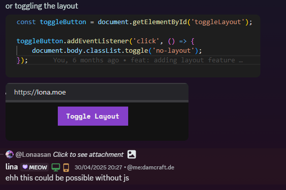
She then showed me how you can add a checkbox input on the same scope as the element you try to change, switch out the previous button for a label, set the "for" attribute of the label to the id of the checkbox and have a css section which changes the neighbour of the checkbox when it is checked.
html
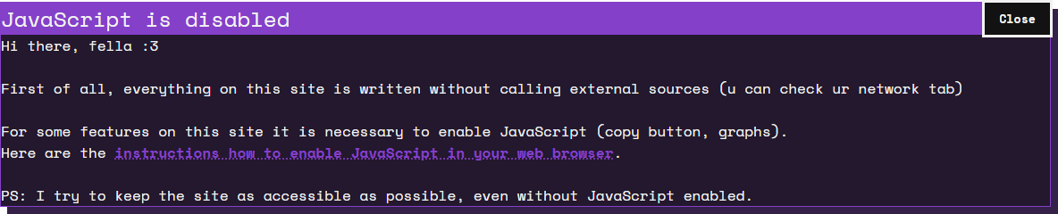
<input type="checkbox" class="hidden-checkbox" id="toggleClose" />
<div class="box box-pop box-code">
    <label class="button button-label box-button" for="toggleClose">Close</label>
    <h2 class="highlight-bg">JavaScript is disabled</h2>
    <!-- More content in the box -->
</div>css
#toggleClose:checked ~ .box {
    display: none;
}The idea of minimizing javascript: Personal thoughts
While I did not yet enounter anyone who strictly blocks all javascript executing on a website (at least not first party scripts), I think it is a fun challenge to work around what you would normally do with a simple js script. Even if it would be faster, the focus here is mostly for funnsies, but if the rare case of "noscript" comes true, I am somewhat prepared xD
The problem: Labels are not really interactable with screen readers and keyboard controls
After implementing the lines above into my html and css, I realized I can not tab through the pseudo "buttons" (labels). Now you would think to just give the label element a tabindex, to make it interactable, but for some reason, a mouseclick on a lable is handled differently from pressing spacebar or enter, so with the simple way not working, how else would you archieve the same effect of accessibility?
Eventually (and after a bit of writing with lina again :3), I realized that we already have a interactable component: the checkbox! So I changed the way the checkbox was hidden from the previous "display: none" to:
css
.hidden-checkbox {
    opacity: 0;
    width: 0;
    height: 0;
    position: absolute;
}After checking if I can reach the checkbox, it worked! So we have the functionality, but now the label is not highlighted anymore. Hence I had to fix this problem too.
The approach would be to look if the checkbox is focused. I used .hidden-checkbox:focus-visible and told it to change the css of the label we want to have selected. In my case:
css
.hidden-checkbox:focus-visible~.box>.button-label,
.hidden-checkbox:focus-visible~.content>.box>.button-label {
    outline: 3px solid var(--text-color) !important;
    font-weight: bold !important;
    color: var(--text-color) !important;
    background-color: var(--bg-color) !important;
    transition-duration: 0s !important;
}(I had to add the "!important" attribute because of other css classes I defined to be semingly being more specific, yeah...)
Now it was done: I now had a working "Button" which could change the look of my website, be it closing and opening a popup, changing the layout to be more narrow or wide, or literally anything else possible with css. Currently only my copy functionality (which you can see in my codeboxes) uses javascript, and sadly I have not yet found a way around that... But now, here is the complete code to implement this system into your own sites:
html
<input type="checkbox" class="hidden-checkbox" id="toggleClose" />
<div class="box box-pop box-code">
    <label class="button button-label box-button" for="toggleClose">Close</label>
    <h2 class="highlight-bg">JavaScript is disabled</h2>
    <!-- More content in the box -->
</div>css
#toggleClose:checked ~ .box {
    display: none;
}

.hidden-checkbox {
    opacity: 0;
    width: 0;
    height: 0;
    position: absolute;
}

.hidden-checkbox:focus-visible~.box>.button-label,
.hidden-checkbox:focus-visible~.content>.box>.button-label {
    outline: 3px solid var(--text-color) !important;
    font-weight: bold !important;
    color: var(--text-color) !important;
    background-color: var(--bg-color) !important;
    transition-duration: 0s !important;
}Beware that this code has custom css classes not shown here. You will need to change some things :3
Mentions
Thanks to Lina for helping me with the idea and the code! You can find her on lina.sh